ShopDreamUp AI ArtDreamUp

Deviation Actions


Suggested Deviants


Suggested Collections


You Might Like…


![Shroom Town ['9x12' Signed Dated and Framed]](https://images-wixmp-ed30a86b8c4ca887773594c2.wixmp.com/f/2b1aaf03-d780-4552-a084-a21b38d13ab8/ddoyqen-f6e30f8e-d2e4-402c-bfb5-0dcde43587dc.jpg/v1/crop/w_184,h_184,x_0,y_15,scl_0.20421753607103,q_70,strp/shroom_town___9x12__signed_dated_and_framed__by_psychedelicartistry_ddoyqen-92s-2x.jpg?token=eyJ0eXAiOiJKV1QiLCJhbGciOiJIUzI1NiJ9.eyJzdWIiOiJ1cm46YXBwOjdlMGQxODg5ODIyNjQzNzNhNWYwZDQxNWVhMGQyNmUwIiwiaXNzIjoidXJuOmFwcDo3ZTBkMTg4OTgyMjY0MzczYTVmMGQ0MTVlYTBkMjZlMCIsIm9iaiI6W1t7InBhdGgiOiJcL2ZcLzJiMWFhZjAzLWQ3ODAtNDU1Mi1hMDg0LWEyMWIzOGQxM2FiOFwvZGRveXFlbi1mNmUzMGY4ZS1kMmU0LTQwMmMtYmZiNS0wZGNkZTQzNTg3ZGMuanBnIiwiaGVpZ2h0IjoiPD01MzMiLCJ3aWR0aCI6Ijw9NDAwIn1dXSwiYXVkIjpbInVybjpzZXJ2aWNlOmltYWdlLndhdGVybWFyayJdLCJ3bWsiOnsicGF0aCI6Ilwvd21cLzJiMWFhZjAzLWQ3ODAtNDU1Mi1hMDg0LWEyMWIzOGQxM2FiOFwvcHN5Y2hlZGVsaWNhcnRpc3RyeS00LnBuZyIsIm9wYWNpdHkiOjk1LCJwcm9wb3J0aW9ucyI6MC40NSwiZ3Jhdml0eSI6ImNlbnRlciJ9fQ.oTUKnue9sMfEMmlPzkhgPuzqQY9xrvt9fx0gPEnATNc)
![Shroom Town ['9x12' Signed Dated and Framed]](https://images-wixmp-ed30a86b8c4ca887773594c2.wixmp.com/f/2b1aaf03-d780-4552-a084-a21b38d13ab8/ddoyqen-f6e30f8e-d2e4-402c-bfb5-0dcde43587dc.jpg/v1/crop/w_92,h_92,x_0,y_8,scl_0.10210876803552,q_70,strp/shroom_town___9x12__signed_dated_and_framed__by_psychedelicartistry_ddoyqen-92s.jpg?token=eyJ0eXAiOiJKV1QiLCJhbGciOiJIUzI1NiJ9.eyJzdWIiOiJ1cm46YXBwOjdlMGQxODg5ODIyNjQzNzNhNWYwZDQxNWVhMGQyNmUwIiwiaXNzIjoidXJuOmFwcDo3ZTBkMTg4OTgyMjY0MzczYTVmMGQ0MTVlYTBkMjZlMCIsIm9iaiI6W1t7InBhdGgiOiJcL2ZcLzJiMWFhZjAzLWQ3ODAtNDU1Mi1hMDg0LWEyMWIzOGQxM2FiOFwvZGRveXFlbi1mNmUzMGY4ZS1kMmU0LTQwMmMtYmZiNS0wZGNkZTQzNTg3ZGMuanBnIiwiaGVpZ2h0IjoiPD01MzMiLCJ3aWR0aCI6Ijw9NDAwIn1dXSwiYXVkIjpbInVybjpzZXJ2aWNlOmltYWdlLndhdGVybWFyayJdLCJ3bWsiOnsicGF0aCI6Ilwvd21cLzJiMWFhZjAzLWQ3ODAtNDU1Mi1hMDg0LWEyMWIzOGQxM2FiOFwvcHN5Y2hlZGVsaWNhcnRpc3RyeS00LnBuZyIsIm9wYWNpdHkiOjk1LCJwcm9wb3J0aW9ucyI6MC40NSwiZ3Jhdml0eSI6ImNlbnRlciJ9fQ.oTUKnue9sMfEMmlPzkhgPuzqQY9xrvt9fx0gPEnATNc)


Featured in Groups

Description
So far this is the fourth or so drawing of mine I've sold in the past few months; got twenty bucks for this dude, which brought me up to 100 in art money before I immediately shelled all of it out on a used drum set for my band. Personally, I identify much more as a musician than a visual artist; so I'm sorta glad I can find some sort of symbiosis in art and music for once. Fine art's something I do when I have nothing to do with my hands and wanna turn my mind off and make a quick buck on occasion. Music's much more of a seemingly endless uphill battle of self improvement that I'll probably not make much at all from for a while. Mostly 'cause I'm not really a proactively social person. Still working on it, though!
(After all, we all know it's the money that really matters (Wink)") )
)
Oh yeah, sorry about forgetting to keep up with the page all the time; 'cause of my ADHD I've got a bit of a habit of completely forgetting about one thing and going crazy on another most o' the time because I get bored really, really fast. In fact, my ADHD's probably the whole reason I can get away with doing so many completely unrelated things at once at the same time. To give an example, here's all the things I want to accomplish sooner or later: Read Infinite Jest all the way through, train to have perfect pitch, get some high contrast gel pens and try making a psychedelic landscape from watching a Bob Ross episode, try to get proficient on keyboard, write and record single using just a pink thrift store Hello Kitty guitar(Sorta almost finished with that one), and writing two entire album's worth of prose and poetry all at once so I can work on writing instrumentals to them all without getting frustrated and giving up over coming up with the lyrics. That was a doozy.
But yeah, if I manage to get all of that done without having any other asinine ideas creep into my head in the meantime; I'll try an' upload more often. No promises yet, though; because you know how I am...
Hope all of you have fantastic days ahead of you! Godspeed, friends!")
(After all, we all know it's the money that really matters
Oh yeah, sorry about forgetting to keep up with the page all the time; 'cause of my ADHD I've got a bit of a habit of completely forgetting about one thing and going crazy on another most o' the time because I get bored really, really fast. In fact, my ADHD's probably the whole reason I can get away with doing so many completely unrelated things at once at the same time. To give an example, here's all the things I want to accomplish sooner or later: Read Infinite Jest all the way through, train to have perfect pitch, get some high contrast gel pens and try making a psychedelic landscape from watching a Bob Ross episode, try to get proficient on keyboard, write and record single using just a pink thrift store Hello Kitty guitar(Sorta almost finished with that one), and writing two entire album's worth of prose and poetry all at once so I can work on writing instrumentals to them all without getting frustrated and giving up over coming up with the lyrics. That was a doozy.
But yeah, if I manage to get all of that done without having any other asinine ideas creep into my head in the meantime; I'll try an' upload more often. No promises yet, though; because you know how I am...
Hope all of you have fantastic days ahead of you! Godspeed, friends!
Image size
3023x3103px 2.12 MB
© 2017 - 2024 owenlarkin
Comments5
Join the community to add your comment. Already a deviant? Log In
Hello! I'm here as a part of  I hope that I am able to give you a few tips that you might find useful in the future!
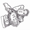
First of all... Sweet! A commission that combines both of your passions. That's cool! And I think you did a good job of it, too. I like the abstract look of it and it leaves a lot to the audience's interpretation. The mass of jumbled figures help to convey the point of disorganization and confusion very nicely. And it really invites the audience to lean in a little bit more to discover every little figure. For an album, it's both thought-provoking and attention-grabbing.
But that brings me to my first point: what kind of album would this be? Sometimes it helps to know which genre of music an album cover is designed for. So a little bit more information would help, too. The other thing that comes to mind is the colour choice. Most political parties have designated colours. To really strike the "political" aspect into your work, instead of falling on colours you usually use, you may want to consider using colours specific to your regional political parties instead. (In Canada and the US, it's blue and red - with some green thrown in. In Taiwan where I came from, it's blue and green with orange thrown in.) The other thing that strikes me is that there are aspects on the periphery that is just black and white lines similar to those "Zentangle" designs. They offer a nice break to the more organic jumble in the middle of the picture. So overall, these "breaking" elements aren't effectively used. Right now they look more like space-fillers in the periphery. But if you spread these elements out into the rest of the picture, you might get an even bigger impact.
Finally, you might want to consider cropping some of the background stuff out (like the "mystery screw" in the bottom corner). They are distracting the viewers' attention away from the main piece itself and because of its bright colours, it's hard not to look away.
I hope this has been helpful to you!
I hope that I am able to give you a few tips that you might find useful in the future! First of all... Sweet! A commission that combines both of your passions. That's cool! And I think you did a good job of it, too. I like the abstract look of it and it leaves a lot to the audience's interpretation. The mass of jumbled figures help to convey the point of disorganization and confusion very nicely. And it really invites the audience to lean in a little bit more to discover every little figure. For an album, it's both thought-provoking and attention-grabbing.
But that brings me to my first point: what kind of album would this be? Sometimes it helps to know which genre of music an album cover is designed for. So a little bit more information would help, too. The other thing that comes to mind is the colour choice. Most political parties have designated colours. To really strike the "political" aspect into your work, instead of falling on colours you usually use, you may want to consider using colours specific to your regional political parties instead. (In Canada and the US, it's blue and red - with some green thrown in. In Taiwan where I came from, it's blue and green with orange thrown in.) The other thing that strikes me is that there are aspects on the periphery that is just black and white lines similar to those "Zentangle" designs. They offer a nice break to the more organic jumble in the middle of the picture. So overall, these "breaking" elements aren't effectively used. Right now they look more like space-fillers in the periphery. But if you spread these elements out into the rest of the picture, you might get an even bigger impact.
Finally, you might want to consider cropping some of the background stuff out (like the "mystery screw" in the bottom corner). They are distracting the viewers' attention away from the main piece itself and because of its bright colours, it's hard not to look away.
I hope this has been helpful to you!